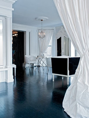
It's a tough discussion, the Blue Debate. I mean, how do you possibly choose the perfect blue?
There's the sophisticated, dignified, thoroughly distinguished blue that is navy. (Which I have always had a soft spot for. And I suspect half of Paris does too, judging by their wardrobes.) There's the rich glamour of royal blue. There's the crisp smartness of French blue, which always reminds me of dress shirts and school uniforms. And finally, there's the soft elegance of periwinkle blue; a blue that's so quietly beautiful, it makes all other blues look flashy by comparison.
Some people think periwinkle blue is simply a pale, watered-down blue, but it actually has a hint of mauve swirled through it. It's a delicate blue and it can be difficult to do. If the paint is tinted too dark it can turn out to be lavender. Too light and it fades to a wishy-washy shade.
It can also be difficult to decorate with, or dress in. Many designers and decorators suggest using it as a dominant feature, which shows off its loveliness, rather than hiding it behind another principal colour such as white. Personally, I love seeing it with a sweep of glossy black; a colour combination that's unexpectedly glamorous and surprisingly sexy.
However you feel about periwinkle (or plumbago, porcelain, sky blue, or whatever else you want to call it), one thing seems certain: it's sneaking its way into the fashion and design worlds. Just look at how much of it was in Chanel's Spring-Summer 2012 show. In fact, many people think that pale blue, and its equally delicate and elegant cousin pale turquoise, could be the colour(s) to watch in 2012 and 2013. {Above image via the inimitable Rodney Smith.}
"It's an ahhh colour! Completely uplifting!"
– Designer Jamie Drake on pale blue
The new Mondrian SoHo hotel, in New York, a poem to periwinkle. {Via Mondrian and Hotel Chatter}
Chanel's Haute Couture Spring-Summer 2012 show, which was more or less a tribute to the prettiest, palest shades of blue. {Via Chanel}
The Hotel Ferrero in Valencia Spain, which is owned by Spanish tennis champ Juan Carlos Ferrero. Look at that blue. It's so unusual for a hotel facade, isn't it? But so perfect for the elegant architecture, the petite size and the gorgeous, glorious, sun-kissed Spanish setting. {Via www.hotelferrero.com}
Pale blue in a French-style interior. I've misplaced the credits for these images and I wish I hadn't because I adore this space. Look at the silk-taffeta drapes, the high-gloss floor, the stunning armoire... If you know whose home this is, please do let me know so I can credit accordingly.
My old apartment in South Yarra. The stripes on the walls were painted in Porter's Paints' Nebular blue (low sheen and pearl gloss), which gave the tiny space the feel of a French salon. (Curiously, it also made the space seem larger.) Oh, how I loved this blue! I'd love to do another apartment in the same colour palette.
JK Place hotel in Florence. I never tire of staring at this beautifully designed space. In this image, the blue looks more turquoise, but in real life it's a pale blue. And while not strictly periwinkle, it's very much in the same family of pale blue hues.
My favourite Jonathan Adler sofa. In fact, this could be my favourite sofa ever. Look at those sexy lines. Doesn't it make you want to pour a martini or a gin and tonic, slip into a white silk dressing gown and spend an entire evening watching episode after episode of Mad Men? {Via jonathanadler.com}
A few of the spectacular pieces from Oscar de la Renta's recent collection. Oh, Oscar. You do know how to do a magnificent blue! {Via Vogue and Dustjacket Attic}
Chanel's alluring blue nail lacquer, highlighted at the recent Haute Couture Spring-Summer 2012 show. {Via Chanel}
The Kelly Wearstler-designed restaurant, BG, at the top of Bergdorf Goodman department store in New York. This is one of my favourite restaurants in New York. The views up Fifth Avenue and across Central Park are as sublime as the interior. {Via Apartment Therapy and Carlos Melia}
The Hotel de Vendôme in Paris. Flashy, but still fabulous. {Via Vendôme}
A print of Lulu Guiness's London home by the talented Anne Harwell of Annechovie. {www.annechovie.blogspot.com}
And more inspirations...


No comments:
Post a Comment