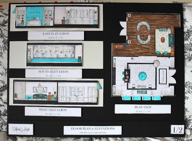
A couple of weeks ago I shared some sneak peek shots of the Tiffany & Co. reception area that I designed for a school project, but it was all crinkled and the pictures were horrible quality.Today I wanted to show you the completed project, including my presentation boards, floor plan, elevations and perspective drawing! It looks so much smoother now that it is glued down.
I wanted to create a sense of classic luxury and refined style that reflected the company's long history in the jewelry business. It was a fun to render in all the architectural detailing. The design was inspired by the exterior of the Tiffany's in Soho:
And my best friend Laura gifted me this sweet little print, which I think ties in just so perfectly with today's post:
I love it!
Lastly, don't forget to hop on over and check out this weeks nursery at the Baby Blog Party! Have a great weekend xo.

I wanted to create a sense of classic luxury and refined style that reflected the company's long history in the jewelry business. It was a fun to render in all the architectural detailing. The design was inspired by the exterior of the Tiffany's in Soho:
 |
| via Architectural Digest |
I love it!
Lastly, don't forget to hop on over and check out this weeks nursery at the Baby Blog Party! Have a great weekend xo.


1 comment:
golden goose
balenciaga sneakers
hermes handbags bag
kd 12
pandora
yeezy boost 350
bape
cheap jordans
kd shoes
chrome hearts outlet
Post a Comment